Posted by Melanie Taljaard ● Fri, Aug 21, 2015 @ 19:08 PM
The importance of a Responsive Design site
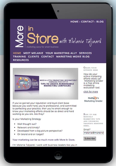
Responsive design is a way of developing websites in such a way that they are viewable on different platforms and devices-desktop computers, personal computers and smartphones. This approach is different from the traditional way of designing websites, not that long ago, it was common for sites to be developed so that they were viewable and navigable on one kind of device exclusively. This new trend, recommended by Google, means only one URL address is needed to access one website, instead of having to develop two different sites.
Here are the reasons why you need a responsive design website: 
Smooth Navigation
Sites developed using responsive design shrink or become larger depending on the screen size of your gadget. The clarity is not compromised in any way. This ability to adjust means your potential customers can navigate easily from site to site with ease and as such, can see the your full offering in one click. Smooth navigation will mean they stay longer on your site, increasing the engagement.
Greater Audience
Smartphone sales have been escalating rapidly for the last five years, as reports Canadian Profit Magazine. The statistics on tablet computers are almost as high. This means more people have access to information on their handheld devices. Having a responsive design site means more potential customers viewing your site. Take advantage of this mobile audience and make an impact on them.
Compliance with Google
The world’s largest search engine recommends that websites be modified to have the responsive design. The World Wide Web Consortium endorses the same. Forbes magazine, on March 26th of 2015, reported that Google would reward mobile friendly websites. This in some sense implies that these sites would rank higher in search results. Google’s guidelines for creating a mobile friendly platform can be found at here
To see how your website looks like in smartphones in tablets, use mobiletest.me. This tool simply requires you to enter your URL from whatever device and your website appears. You can choose what and where to improve on afterwards.
Cutting costs on website development
Traditionally, if companies wanted a mobile site and a traditional website, website developers had to develop two websites. One would run on desktop PCs while the other would be tailor made for phones. Smartphones however, have been manufactured in such a way that their functioning in terms of web browsing can accommodate webpages designed for desktops and laptops. In the long run, you save valuable time and money that would otherwise be used in developing a different program for a mobile website. In addition to that, potential clients get to see what would otherwise only be offered on a traditional website.
Ready to see how your website stacks up compared to your competitors and how the experience ranks for your customers, try the free marketing grader.
Topics: online marketing


